By Jeff Melton
Competitive ecommerce retailers are implementing personalization solutions to improve customer experience and, in turn, increase revenue. But these high-tech tools can come with a high cost and, when underutilized, may not deliver the anticipated return on investment.
By design, ecommerce personalization platforms are highly automated and use future-forward artificial intelligence and machine learning technologies. However, a skilled expert still needs to set up and manage the software to ensure optimal results.
While a specialist can optimize personalization to create a seamless shopping experience across a brand’s entire website, there are four critical web pages retailers should prioritize for ecommerce personalization.
Is your ecommerce company optimizing personalization on these pages?
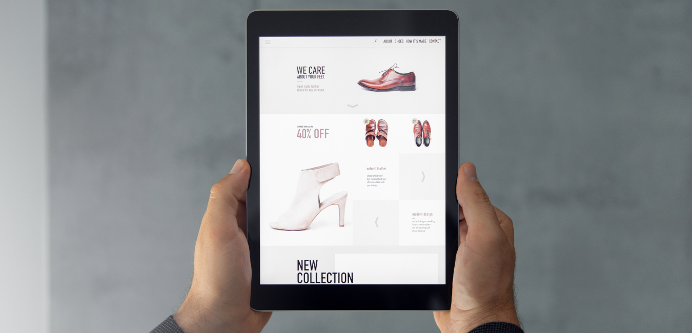
1. The Home Page
A home page isn’t just an introduction to a retail industry blogs site; it’s where the selling process begins. Competitive retailers provide containers of recommended products on their home pages and use language such as “Top Trends,” “Best Sellers,” or “Most Popular” to attract first-time visitors.
One common mistake is making the titles of these product containers too personal for first-time visitors. Avoid using language such as “Our Picks for You” or “Recommended for You” on the home page if a shopper has never visited before, as these claims can come across as insincere or misleading. Realistically, retailers can’t make personalized recommendations until they know a bit about their customers.
Another misstep is curtailing product recommendations to a popular demographic, which risks alienating other potential customers. For example, while browsing a large shoe retailer for the first time, we noticed the home page recommended only women’s sandals and sneakers. A simple tweak to the product selection could drastically improve the experience by making it inclusive to all shoppers.
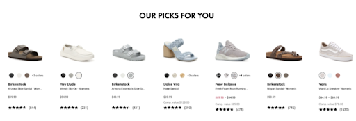
As shoppers navigate a website, the personalization platform can identify their behaviors and make “smart” recommendations based on their interactions with the site. When shoppers return to the home page, the platform is then able to accurately and authentically curate products for them. At this point, the language can change to “Our Picks For You” or “Our Recommendations For You,” and the product selection can become more personalized to their demographic.
2. The Product Listing Page
A product listing page showcases all items in a given category. A personalized experience leveraging geo-targeting can significantly improve a visitor’s experience on that page.
Retailers risk site abandonment when they fail to consider their customers’ locations and serve product options that are unavailable. Ideally, shoppers should be shown what’s available to them in their geographical location first, with sold-out products near the bottom of the page.
When scrolling a national furniture company’s website looking at leather seating sets, we noticed that every option was unavailable in our area. Effective geo-targeting could have made for a much better user experience.
3. The Product Detail Page
Product detail pages are designed to showcase one specific product, but that doesn’t mean you can’t inspire your shoppers to discover (and purchase) relevant, complementary products.
In fact, it’s a best practice for product detail pages to include two types of recommendations powered by a personalization platform:
- “You May Also Like.” A container labeled “You May Also Like” shows shoppers other items from the same category. For instance, if a shopper is looking at accent chairs, the site might suggest alternative accent chairs. This recommendation isn’t an upsell opportunity but a chance to ensure the shopper continues browsing until they find an item to purchase.
- “Complete the Look.” A second container labeled “Complete the Look” helps drive revenue by enabling retailers to upsell coordinating items. Although powered by a personalization platform, this container is entirely built by the merchandising team. Retailers curate a collection of complementary items to showcase to the shopper, and the platform serves it to them. For a shopper looking at accent chairs, the retailer might suggest relevant, coordinating furnishings such as a throw pillow, ottoman, side table, and table lamp.
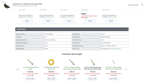
While many retailers include recommendations on their product detail pages, one common mistake leaves money on the table: serving shoppers products that aren’t relevant.
For example, while browsing a national hardware store for lawn mowers, the site recommended purchasing lumber and wire when garden supplies would have been a more logical and relevant suggestion. With the proper adjustments, the retailer could make better recommendations and increase their average order value (AOV).
 4. The Cart Page
Some brands make the mistake of using a pop-up or modal on the side of the screen instead of having a dedicated cart page. We highly discourage this practice for two key reasons: first, it could make the site “inaccessible” by Americans with Disabilities Act (ADA) standards; and second, it prevents retailers from making product recommendations.
Here’s an example of an unoptimized cart using the drawer-style format:
Some retailers attempt to display a mobile-style experience on desktop, but a drawer-style cart is not a good experience for a desktop consumer.
It’s a best practice to design the experience to the device. Consumers generally prefer the additional screen real estate that a desktop experience offers. The drawer-style experience also requires scrolling to see most of the cart details when this information could easily be provided above the fold on a desktop.
These considerations, and others, create significant ADA accessibility issues. While the information displayed is helpful, this cart experience is not optimized for the device and does not leverage the power of product recommendations to increase AOV.
Creating an optimized cart experience
A dedicated cart page optimized to provide relevant, customized recommendations to the shopper not only drives revenue but also creates an excellent customer experience.
Consider showing shoppers “recently viewed items” and upsell products that complement what they already have in their cart. Meaningful product suggestions can increase the attachment rate and AOV.
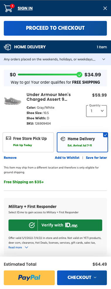
Here’s an example of a great cart that provides an informative and optimized customer experience:
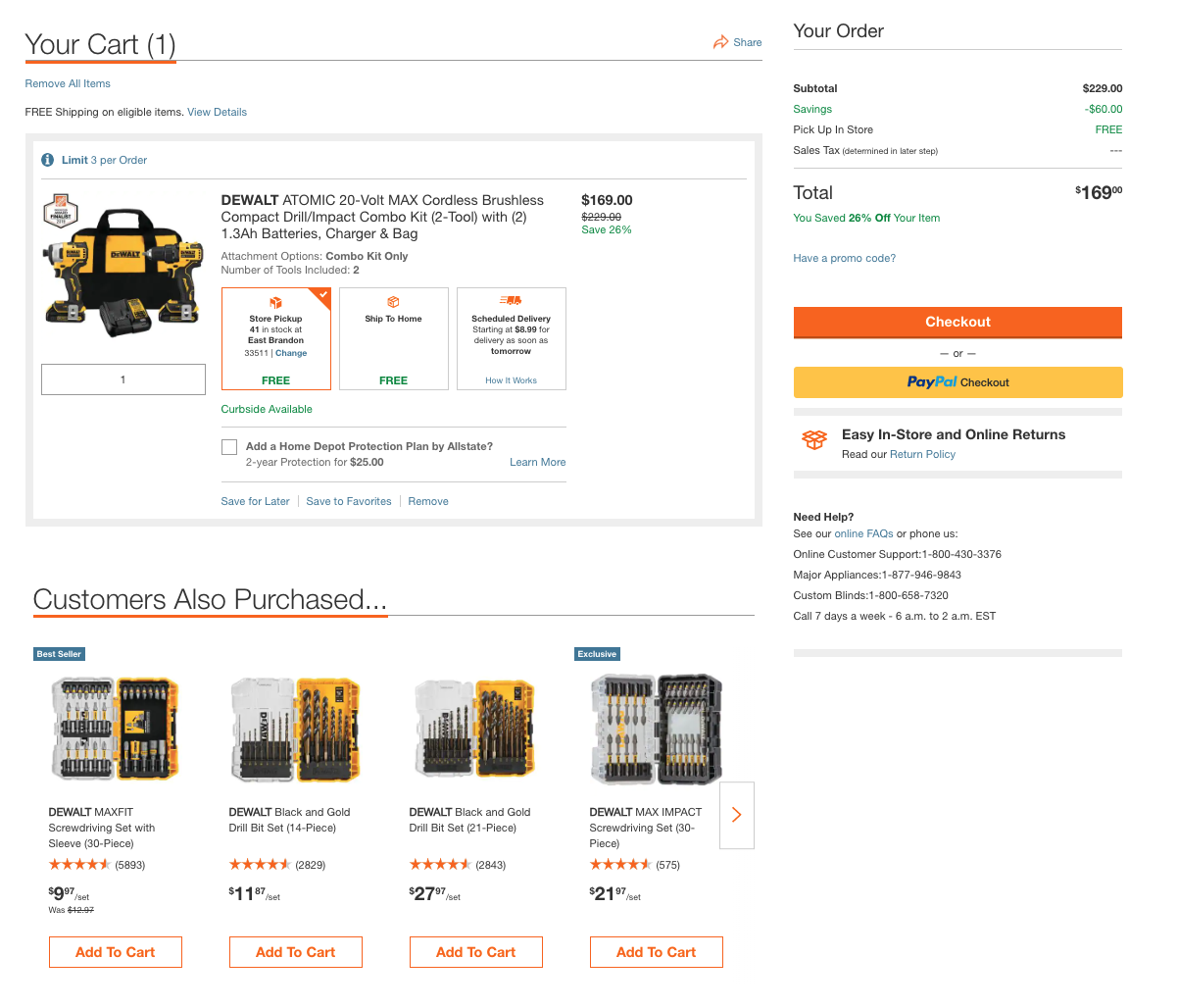
This cart is ideal for the following reasons:
- Clear product image and product description
- Clear messaging on number of items included
- Clear pricing with discount percentages readily apparent
- Cart is omnichannel and shows different options for delivery or pick-up at the local store
- Easy ability to add a product protection plan with clear costs
- Ability to remove all items from cart in bulk if needed
- Easy ability to share the cart with another person
- Product recommendations include accessory items that are low dollar amounts but entice impulse purchasing to increase basket size
- Return policy is readily accessible below the checkout button
- Information such as access to FAQs, applicable phone numbers, and hours of operation are clearly visible
Conduct More Tests for Better Results
These are some of the lessons learned from Sophelle’s extensive experience running personalization services for over 70 leading ecommerce sites. While personalization platforms can appear intuitive and seem “easy” to implement, dedicated expertise and resources are required to maintain them successfully.
Specialists, like our platform-agnostic team at Sophelle, have the skills, capacity, and mindset needed to optimize any personalization tool. If you want to improve the ecommerce personalization retail strategy for your business, contact Sophelle about a risk-free personalization trial.